How to avoid Scroll of Death in Moodle course area
Here is a quick tutorial on how to avoid the infamous “Scroll of Death” in Moodle course area. Teachers will quickly find that over time, and with built up of resources, the course page can become very long and tedious to navigate. Here are ways to avoid the Scroll of Death” without installing any plugins.
Some basic tips to avoid a long course page are to:
- Keep the number of Topics tight, only create topics that are necessary
- Keep Topic header short and summary blank (if possible)
- Keep multiple files in Folder and Sub folders
- Keep long textual and media content in Page or Book
- Avoid duplicate activities and resources
Now for the steps that make a real difference:
1. Show one section per page
Login as a teacher with editing rights then go to your course.
- Click on the Settings to edit course settings
- Scroll down to Course format and click to expand
- Both Topics format and Weekly format support showing one section per page
- Under Course layout, switch to Show one section per page
This will limit the course page view to just one section per page. The course home page will still have topic headings and summary but in collapsed format. This means all activities and resources are hidden until you click on the topic.

2. Remove or Reduce Summary, Activities and Resources in Topic O
The very first topic on the page, sometimes known as Topic O or General area will show on the top of the course page.
Even if you change Course Layout to Show one section per page using steps above, it will hang around on every page.
Move these activities and resources into Topic 1 where possible.
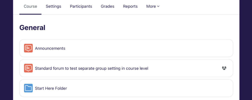
3. Move Topic Summary into a Label / Text and Media Area
To further reduce scrolling, make sure you leave the Topic Summary blank. If you have to add text under the Topic header, use ‘Label’ or “Text and Media Area”. Steps to do this in the following section. This will ensure that in collapsed mode, there are no additional text under the Topic header. See image below topic with no summary vs one with a long summary text.
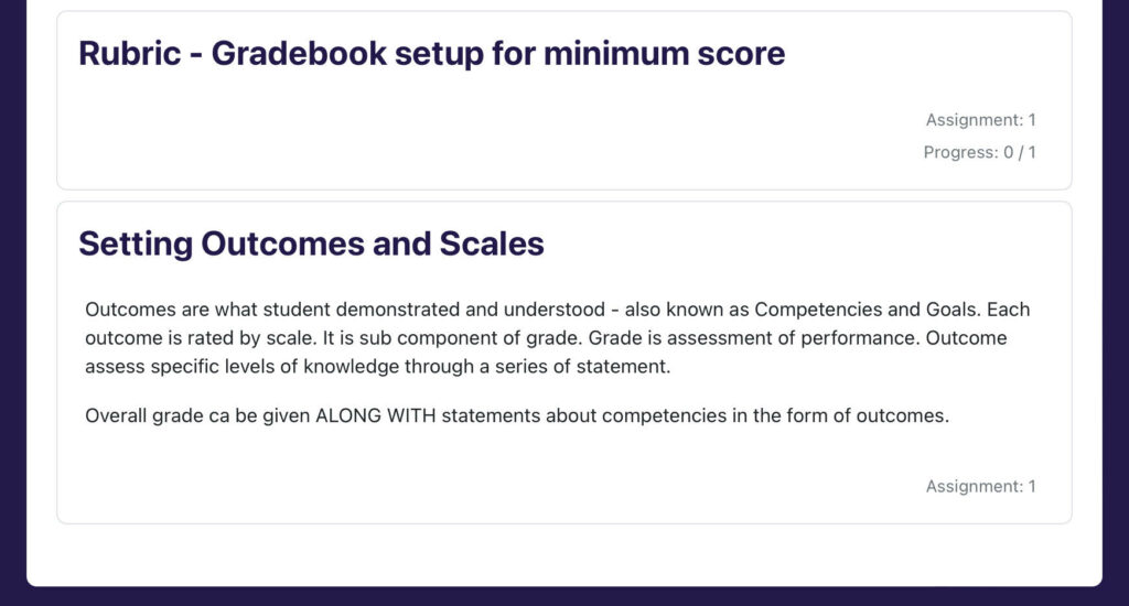
To move your summary into a label or text area use the following steps,
- Go to the Course area > turn edit mode on > click on (+) Add an activity or resources
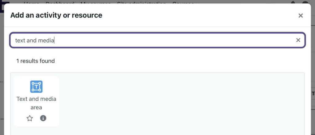
- Click or search and click on Text and media area icon (image below)
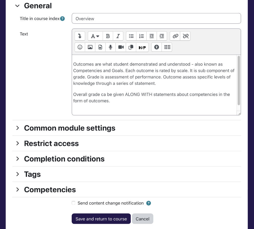
- You can put the Title in course index as Overview
- Then paste your topic summary into the Text area.
- Click Save and return to course
Here is what the settings for Text and Media Area looks like with the summary in the text area.
4. Create Your Own Quick Jump Links

You can create links to quick jump to different sections / topics using the following URL format
https://www.yourmoodlesite.com/course/view.php?id=8§ion=1Replace 8 and 1 with course ID and section respectively
You can find your the link in the address bar. Simply visit the section or topic and copy the URL from the address bar.
You can then add the link(s) in Topic O (or General) as this will appear across all pages in ‘one section per page layout’.
It will then serve as a quick jump to different sections on top of the collapsible navigation side bar.
Here is how to do it.
- Login as a teacher with editing rights, go to Course area and turn edit mode on
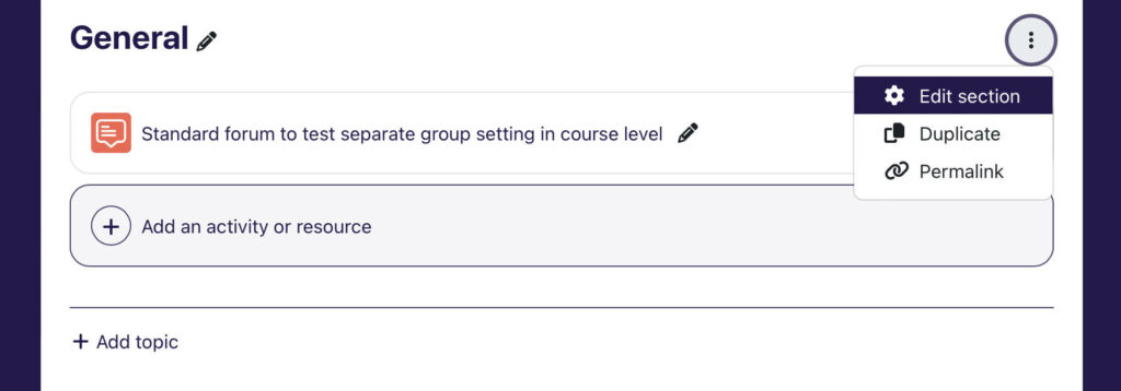
- Click on the context menu (three dots) for Topic 0 > click Edit section (image above)
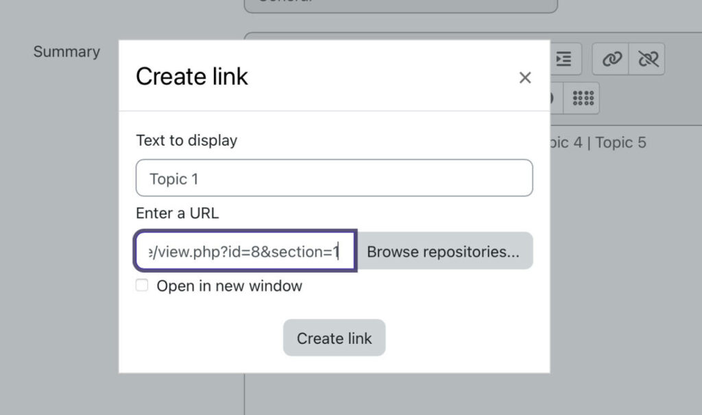
- In the Summary, enter your link labels e.g. Topic 1 then highlight and click on the chain icon to add your link (image below)
- Paste your link into Enter a URL field then click Create link
- Add the rest of the links then click Save changes.

The Create link pop-up window where you enter your URL is shown below.
Open your course page in a separate tab to copy the exact link to the different sections to paste here if needed.
You can then use these links to jump from one section to the next quickly in your new Course layout that shows one section per page.
How to create quick jump for Moodle Courses
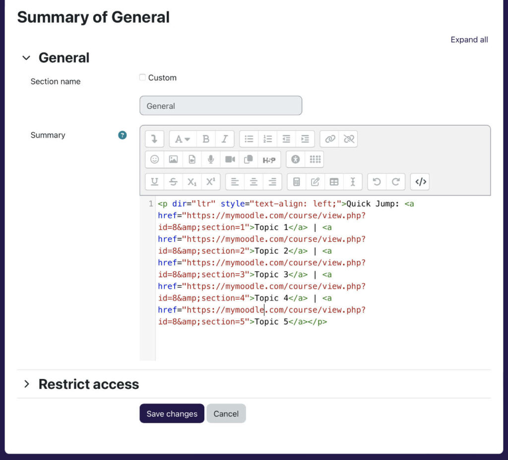
You can duplicate the quick jump links above to other courses by turning to HTML editor mode, and copying the code, paste it into a new course summary, then change the course ID. Depending on your text editor, to switch to HTML editor mode, click on the first button to expand the third row of the menu then click on the last icon [<>]. You can toggle back to text mode by clicking on the same button.
If you have the HTML code for one course, you can copy, paste this in HTML editor mode (toggle the menu using the first button to expand the third row, HTML mode is the last button) into every course then change the course ID (highlighted) in the links.
5. Navigating the ‘One section per page’ Course Layout
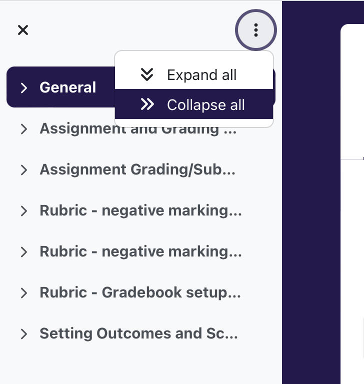
With your new course layout, use the collapsible side bar on the left (in Boost theme) to navigate one to different sections.
Encourage users to use the side bar to navigate between section.
Also get users to familiarise themselves with the Expand all and Collapse all functions which can be good to reduce the menu items.
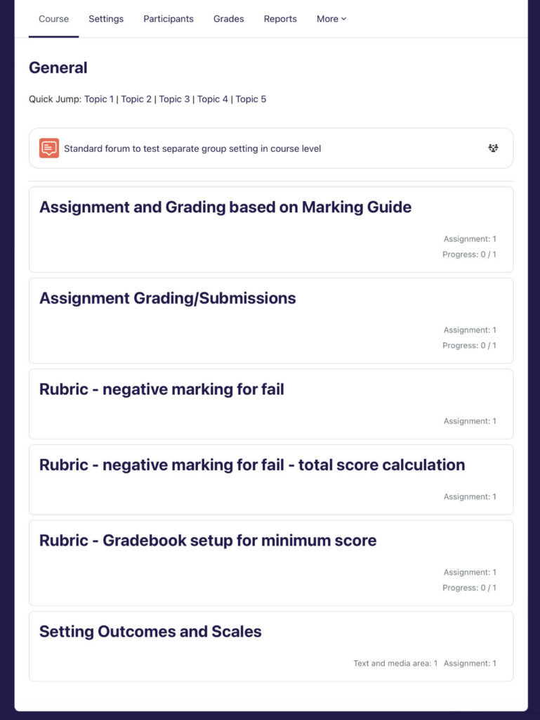
If you land on the course home page, you can also click on the topic header from the list in the main body (image below). Feel free to change General to “Go to course main page” if it helps as it serves as a link to the main list page from any of the sections. Alternatively, use the Topic links you have just created.
If you have further tips and thoughts share with us by leaving a comment below.
